---
title: "Building a publication figure with MRMhub"
subtitle: "SPERFECT"
author:
- name: "Bo Burla"
affiliation: "National University of Singapore"
- name: "Guo Shou Teo"
- name: "Hyungwon Choi"
date: "`r Sys.Date()`"
format:
html:
code-tools: true
code-overflow: wrap
toc: true
fig-align: center
---
# About this notebook
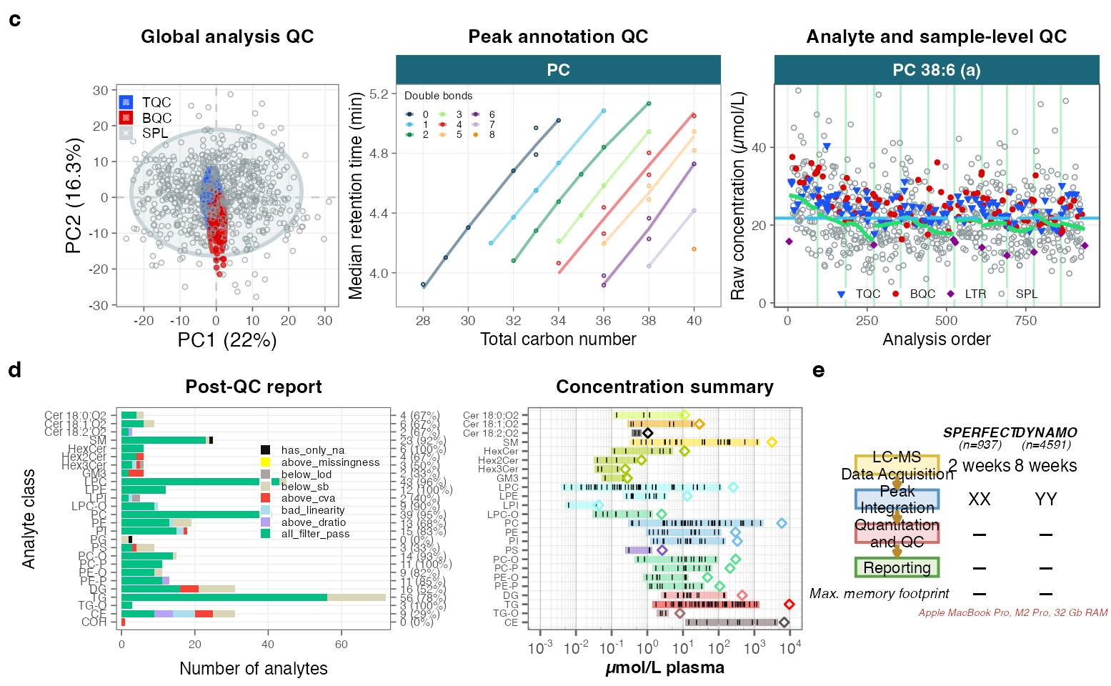
The lower half of the manuscript's main workflow figure is reproduced here from the
Dataset 1 (SPERFECT) pipeline, on a 3 × 2 grid composed with patchwork: panel c
(*Global analysis QC*, *Peak annotation QC*, *Analyte and sample-level QC*), panel d
(*Post-QC report*, *Concentration summary*) and panel e (the SPERFECT-vs-DYNAMO
runtime / memory benchmark).
Panels c and d are standard mrmhub plots (`plot_pca`, `plot_rt_vs_chain`, `plot_runscatter`,
`plot_qc_summary_byclass`, `plot_abundanceprofile`) built from a single `MRMhubExperiment`
object, following the same pipeline as `Dataset1.qmd` (see that notebook for the full
narrative). Panel e is drawn here from the measured runtimes written by
`scripts/benchmark_runtime.R`. The composed figure is written to
`output/ManuscriptFigure_panelsCDE.{png,pdf}`; the vector PDF is the ingredient combined with
the hand-drawn schematic panels (a, b) in a vector editor (Illustrator) for the final
manuscript figure.
::: callout-important
## Data availability
Needs the Dataset 1 data (`data/dataset-1/Dataset1_MRMhub-INTEGRATOR_Final.csv` +
`Dataset1_Metadata.xlsx`). These exceed GitHub's file-size limit and are therefore not
part of the [GitHub repository](https://github.com/SLINGhub/MRMhub-workflows). Download
`mrmhub-workflows.zip` from the Zenodo record
[10.5281/zenodo.15370293](https://doi.org/10.5281/zenodo.15370293) (*MRMhub-workflows*), which
is this complete repository with all data included.
A clean `quarto render` re-runs the full Dataset 1 pipeline; for iterating on figure
layout, run the pipeline once interactively and then re-run only the panel chunks.
:::
```{r chunk01-setup}
#| cache: false
knitr::opts_chunk$set(
  collapse = TRUE,
  message = FALSE, warning = FALSE, comment = "#>", out.width = "100%",
  dev = "ragg_png") # Unicode-safe device (renders the µ in "µmol/L")
set.seed(1041)

library(dplyr)
library(ggplot2)
library(stringr)
library(patchwork) # composite figure assembly
library(mirai) # parallel processing (picked up automatically by mrmhub)
library(mrmhub)

# Use all-but-one core (leaving one free so the system stays responsive)
n_cores <- {
  n <- parallel::detectCores()
  if (is.na(n)) n <- 4L
  max(1L, n - 1L)
}
if (mirai::status()$daemons == 0) mirai::daemons(n_cores)

base_font_size <- 9 # ~50% larger than the 180 mm-print value (6) for on-screen readability
example_species <- c("PC 38:6 \\(a\\)") # representative feature for the run-scatter panel

# dark-teal facet-strip styling used across the QC panels
strip_teal <- theme(
  strip.background = element_rect(fill = "#1b6779", colour = NA),
  strip.text = element_text(
    colour = "white",
    face = "bold", size = base_font_size))
panel_title <- function(t)
  list(
    labs(title = t),
    theme(
      plot.title = element_text(
        size = base_font_size + 1,
        face = "bold", hjust = 0.5)))

dir.create("output", showWarnings = FALSE, recursive = TRUE)
```
::: callout-note
## mrmhub version
This notebook was rendered with **mrmhub 0.9.9** (QUANT module of
[MRMhub](https://github.com/SLINGhub/MRMhub)); install with
`pak::pak("SLINGhub/MRMhub")`.
:::
# 1 · Reproduce the Dataset 1 pipeline
The steps below mirror `Dataset1.qmd` and bring `mexp` to its final state (normalized,
quantified, drift/batch-corrected). `mexp_final` is the QC-feature-filtered object used by
the reporting panels. See `Dataset1.qmd` for the full narrative.
```{r chunk02-import}
mexp <- MRMhubExperiment()
mexp <- import_data_mrmhub(
mexp,
"./data/dataset-1/Dataset1_MRMhub-INTEGRATOR_Final.csv")
mexp <- import_metadata_msorganiser(
mexp,
"./data/dataset-1/Dataset1_Metadata.xlsx", ignore_warnings = TRUE)
# Exclude the known technical-outlier analysis. Done AFTER metadata import because the
# import rebuilds the analysis annotation and would otherwise reset the exclusion. This is
# the sample that otherwise dominates PC1 in the Global-analysis-QC PCA.
mexp <- exclude_analyses(
mexp,
analyses = "Longit_batch6_51", clear_existing = TRUE)
```
```{r chunk03-normalize-quantify}
mexp <- normalize_by_istd(mexp)
mexp <- quantify_by_istd(mexp)
```
```{r chunk04-drift-batch-correction}
mexp <- correct_drift_gaussiankernel(
  mexp,
  variable = "conc",
  ref_qc_types = "SPL",
  batch_wise = TRUE, kernel_size = 20, outlier_filter = TRUE,
  outlier_ksd = 3, recalc_trend_after = TRUE, show_progress = FALSE)
mexp <- correct_batch_centering(
  mexp,
  ref_qc_types = "SPL",
  variable = "conc")
```
```{r chunk05-qc-filter}
mexp <- calc_qc_metrics(
  mexp,
  use_robust_cv = FALSE, use_batch_medians = TRUE)

mexp_final <- filter_features_qc(
  data = mexp,
  recalc_metrics = TRUE, clear_existing = TRUE, use_batch_medians = TRUE,
  include_qualifier = FALSE,
  include_istd = FALSE,
  response.curves.selection = c(1, 2),
  response.curves.summary = "mean",
  min.rsquare.response = 0.8,
  min.slope.response = 0.5,
  max.yintercept.response = 0.5,
  min.signalblank.median.spl.pblk = 10,
  min.intensity.median.spl = 100,
  max.cv.conc.bqc = 25,
  max.dratio.sd.conc.bqc = 0.75,
  max.prop.missing.conc.spl = 100,
  features.to.keep = c(
    "CE 20:4",
    "CE 22:5", "CE 22:6", "CE 16:0", "CE 18:0"))
```
`mexp` carries, per sample, the raw `intensity`, the pre-correction `conc_raw`, and the
final corrected `conc`; `mexp_final` additionally carries the QC-filter result.
# 2 · Panel c — QC diagnostics
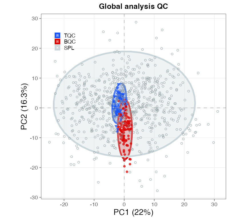
```{r chunk06-panelC-global, fig.width = 4.5, fig.height = 4}
#| label: fig-mf-panelc-pca
#| fig-cap: "**Panel c — global analysis QC.** PCA of the QC and study samples."
# c-left · Global analysis QC — PCA of QC and study samples
pC1 <- plot_pca(
  data = mexp,
  variable = "intensity",
  filter_data = FALSE,
  pca_dims = c(1, 2),
  qc_types = c("SPL", "BQC", "TQC"),
  ellipse_variable = "qc_type",
  log_transform = TRUE,
  include_istd = FALSE,
  show_labels = FALSE, point_size = 1, point_alpha = 0.7,
  font_base_size = base_font_size, ellipse_alpha = 0.3) +
  panel_title("Global analysis QC") +
  theme(
    legend.title = element_blank(),
    legend.position = "inside", legend.position.inside = c(0.13, 0.85),
    legend.background = element_blank(),
    legend.text = element_text(size = base_font_size * 0.8),
    legend.key.size = unit(base_font_size * 0.9, "pt"))
pC1
```
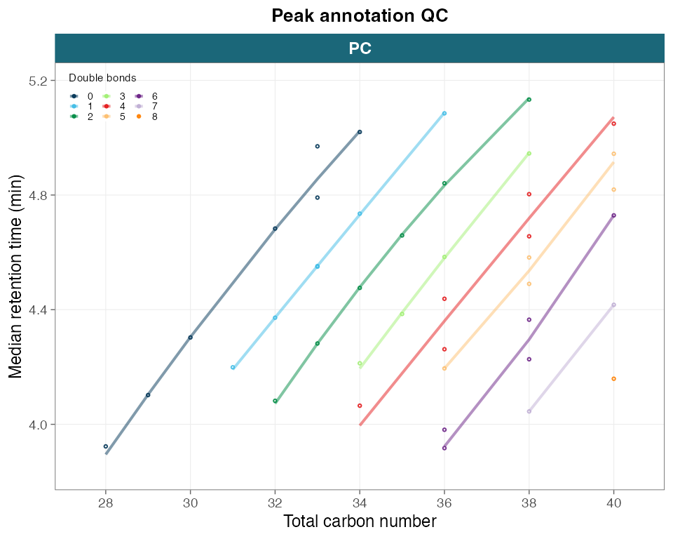
```{r chunk07-panelC-annotation, fig.width = 5, fig.height = 4}
#| label: fig-mf-panelc-annotation
#| fig-cap: "**Panel c — peak-annotation QC.** Retention time versus total carbon number for the PC class."
# c-middle · Peak annotation QC — retention time vs carbon number, PC class
mexp_pc <- mexp
mexp_pc@dataset <- mexp@dataset |> filter(str_detect(feature_id, "^PC \\d"))
pC2 <- plot_rt_vs_chain(
  mexp_pc,
  qc_types = "SPL",
  x_var = "total_c", font_base_size = base_font_size) +
  panel_title("Peak annotation QC") +
  strip_teal +
  labs(
    x = "Total carbon number",
    y = "Median retention time (min)",
    # colour and fill both encode double-bond count; share a title so the two
    # legends merge into one instead of showing a redundant "total_db" legend
    colour = "Double bonds", fill = "Double bonds") +
  # all points are "No" outliers -> drop the uninformative shape legend and tuck the
  # double-bond legend into the empty top-left corner (data runs on a rising diagonal)
  guides(
    colour = guide_legend(ncol = 3, order = 1),
    fill = guide_legend(ncol = 3, order = 1), shape = "none") +
  theme(
    legend.position = "inside",
    legend.position.inside = c(0.02, 0.98), legend.justification = c(0, 1),
    legend.box = "horizontal", legend.title.position = "top",
    legend.background = element_blank(), legend.spacing = unit(1, "pt"),
    legend.margin = margin(1, 1, 1, 1), legend.box.spacing = unit(0, "pt"),
    legend.text = element_text(size = base_font_size * 0.6),
    legend.title = element_text(size = base_font_size * 0.65),
    legend.key.size = unit(base_font_size * 0.6, "pt"))
pC2
```
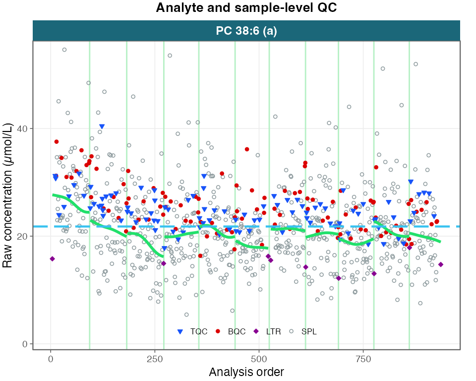
```{r chunk08-panelC-runscatter, fig.width = 5, fig.height = 4}
#| label: fig-mf-panelc-runscatter
#| fig-keep: last
#| fig-cap: "**Panel c — analyte and sample-level QC.** Run-scatter of a representative feature across the run order."
# c-right · Analyte and sample-level QC — run-scatter of a representative feature
pC3 <- plot_runscatter(
  mexp,
  variable = "conc_raw",
  include_feature_filter = example_species,
  qc_types = c("SPL", "BQC", "TQC", "LTR"),
  show_reference_lines = TRUE,
  ref_qc_types = "SPL",
  reference_fill_color = "#b83c3cff", reference_line_color = "#37c2f0ff",
  reference_k_sd = NA, show_trend = TRUE, point_size = 1,
  font_base_size = base_font_size, cols_page = 1, rows_page = 1,
  cap_outliers = FALSE, reference_sd_shade = FALSE, show_progress = FALSE,
  output_pdf = FALSE, return_plots = TRUE)[[1]] +
  panel_title("Analyte and sample-level QC") +
  strip_teal +
  labs(y = "Raw concentration (µmol/L)") +
  coord_cartesian(clip = "off") +
  theme(
    legend.position = "inside",
    legend.position.inside = c(0.5, 0.06), legend.direction = "horizontal",
    legend.background = element_blank(), legend.margin = margin(0, 0, 0, 0),
    plot.margin = margin(t = 2, r = 12, b = 2, l = 2),
    legend.text = element_text(size = base_font_size * 0.7),
    legend.title = element_text(size = base_font_size * 0.7),
    legend.key.size = unit(base_font_size * 0.7, "pt"))
pC3
```
# 3 · Panel d — Reporting
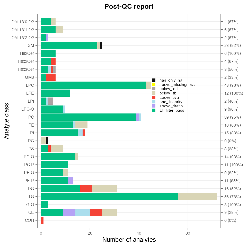
```{r chunk09-panelD-postqc, fig.width = 5, fig.height = 5}
#| label: fig-mf-paneld-postqc
#| fig-cap: "**Panel d — post-QC report.** Feature QC outcome per lipid class."
# d-left · Post-QC report — feature QC outcome per lipid class.
# Order the classes by the canonical {mrmhub} lipidomics map (same order the
# Concentration-summary panel uses) instead of alphabetically, and drop phantom
# classes made up solely of ISTD/qualifier features (they would otherwise show as
# empty rows or an NA level — cf. Dataset3.qmd).
mexp_pd <- mexp_final
keep_classes <- mexp_pd@metrics_qc |>
  filter(valid_feature, in_data, pass_istd, pass_qualifier) |>
  pull(feature_class) |>
  unique() |>
  as.character()
keep_classes <- keep_classes[!is.na(keep_classes)]
mexp_pd@metrics_qc <- filter(
  mexp_pd@metrics_qc,
  feature_class %in% keep_classes)

lipid_map <- get(
  "pkg.env",
  envir = getNamespace("mrmhub"))$lipid_class_annotations$lipid_class_map
class_order <- c(
  names(lipid_map)[names(lipid_map) %in% keep_classes],
  setdiff(keep_classes, names(lipid_map)))
mexp_pd@metrics_qc$feature_class <- factor(
  as.character(mexp_pd@metrics_qc$feature_class),
  levels = class_order)

pD1 <- plot_qc_summary_byclass(mexp_pd) +
  panel_title("Post-QC report") +
  labs(x = "Analyte class", y = "Number of analytes") + # manuscript wording
  theme(
    strip.text = element_text(size = 7),
    axis.text = element_text(size = 6),
    axis.title = element_text(size = base_font_size),
    axis.title.y.right = element_blank(),
    axis.title.x.top = element_blank(), legend.position = "inside",
    legend.position.inside = c(0.74, 0.62), legend.direction = "vertical",
    legend.title = element_blank(), legend.background = element_blank(),
    legend.margin = margin(0, 0, 0, 0),
    legend.text = element_text(size = base_font_size * 0.65),
    legend.key.size = unit(base_font_size * 0.7, "pt"))
pD1
```
```{r chunk10-panelD-concsummary, fig.width = 5, fig.height = 5}
#| label: fig-mf-paneld-concsummary
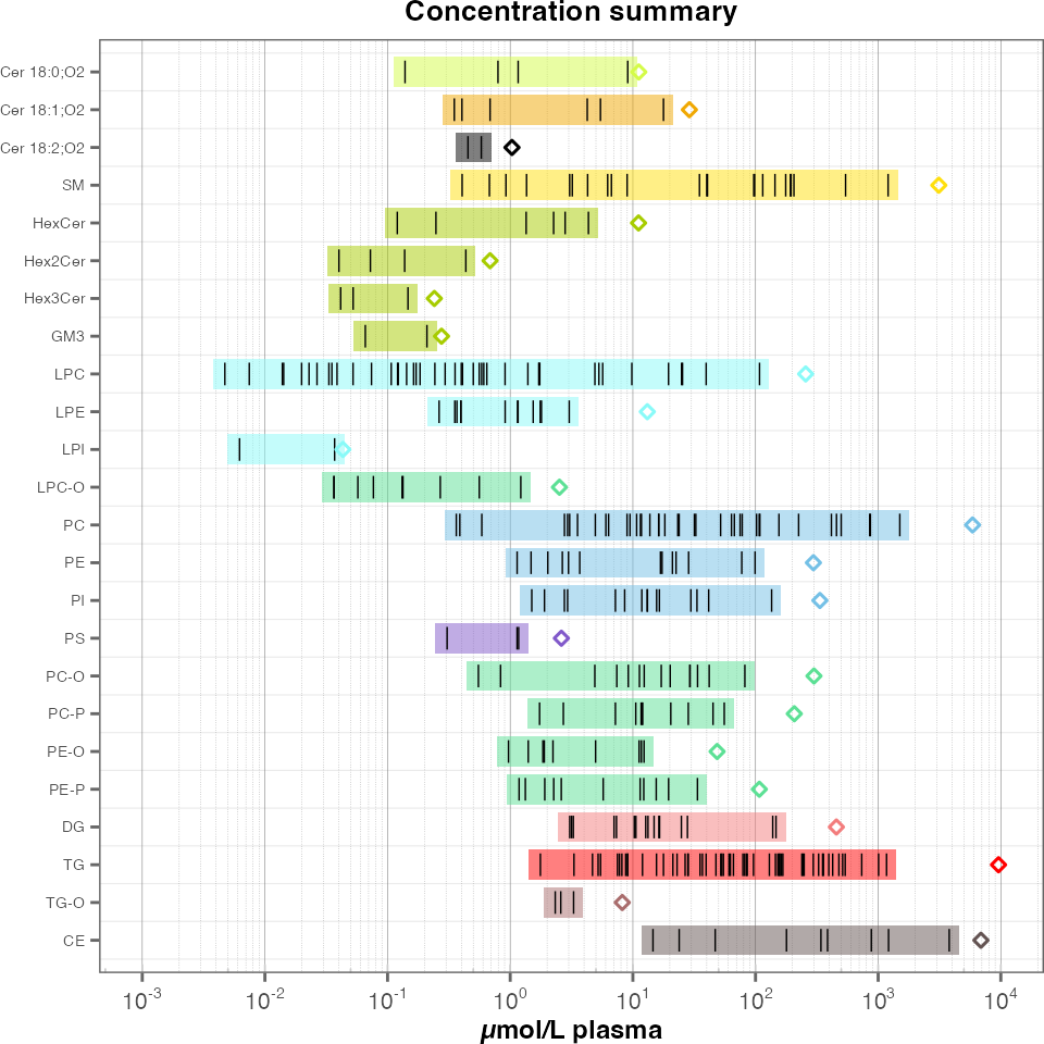
#| fig-cap: "**Panel d — concentration summary.** Per-class concentration distribution of the filtered study samples."
# d-right · Concentration summary — per-class concentration distribution
pD2 <- plot_abundanceprofile(
  data = mexp_final,
  log_scale = TRUE,
  variable = "conc",
  filter_data = TRUE,
  qc_types = "SPL",
  x_label = NA, font_base_size = base_font_size,
  feature_map = "lipidomics",
  y_axis_position = "left") + # class labels on the LEFT so they don't squeeze panel e
  panel_title("Concentration summary") +
  labs(x = "µmol/L plasma") + # manuscript wording
  # many class rows share one grid cell -> shrink the class labels so they don't collide
  theme(
    axis.text.y = element_text(size = base_font_size * 0.6),
    legend.text = element_text(size = base_font_size * 0.7),
    legend.key.size = unit(base_font_size * 0.7, "pt"))
pD2
```
# 4 · Panel e — runtime benchmark
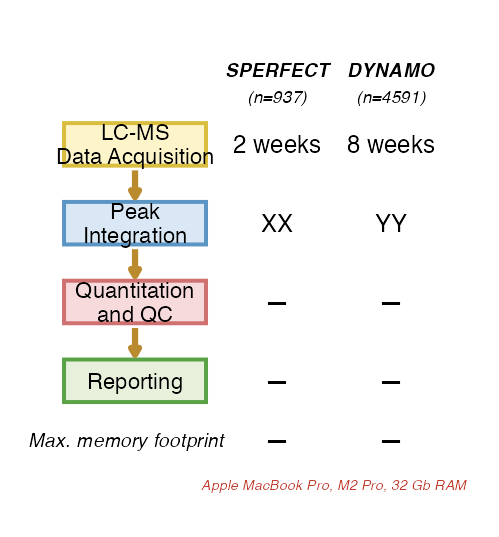
Panel e is a small flow diagram comparing the two datasets (**SPERFECT** = Dataset 1, n = 937;
**DYNAMO** = Dataset 3, n = 4591) across the pipeline stages. The **Quantitation and QC** and
**Reporting** rows and the **max. memory footprint** are *measured on this machine* by
`scripts/benchmark_runtime.R`, which runs each dataset's QUANT pipeline and its run-scatter /
response-curve QC report and writes `output/timing_dataset{1,3}.rds`. Run that script once
before rendering. The LC-MS-acquisition row is the instrument time (a reference estimate) and
the **Peak Integration** row is shown as `XX`/`YY` placeholders to be filled in by hand
(integration runs in the separate INTEGRATOR desktop app, not timed here).
```{r chunk11-panelE-benchmark, fig.width = 2.6, fig.height = 2.8}
#| label: fig-mf-panele-benchmark
#| fig-cap: "**Panel e — runtime benchmark.** SPERFECT versus DYNAMO runtime and memory footprint across the pipeline stages."
read_timing <- function(path)
  if (file.exists(path)) readRDS(path) else
    list(
      import_sec = NA,
      quant_qc_sec = NA, reporting_sec = NA, peak_mem_gb = NA)
t1 <- read_timing("output/timing_dataset1.rds") # SPERFECT
t3 <- read_timing("output/timing_dataset3.rds") # DYNAMO
if (anyNA(c(t1$quant_qc_sec, t3$quant_qc_sec)))
  message(
    "Timing files missing — run scripts/benchmark_runtime.R to populate panel e.")

fmt_time <- function(sec)
  if (is.null(sec) || is.na(sec)) "—" else if (sec < 90)
    sprintf("%.0f sec", round(sec)) else sprintf("%.1f min", sec / 60)
fmt_mem <- function(gb)
  if (is.null(gb) || is.na(gb)) "—" else if (gb < 1) "<1 Gb" else
    sprintf("%.1f Gb", gb)

# measured rows (Quantitation and QC = import + QUANT compute; Reporting = QC-report PDFs)
quant1 <- fmt_time(t1$import_sec + t1$quant_qc_sec)
quant3 <- fmt_time(t3$import_sec + t3$quant_qc_sec)
rep1 <- fmt_time(t1$reporting_sec)
rep3 <- fmt_time(t3$reporting_sec)
mem1 <- fmt_mem(t1$peak_mem_gb)
mem3 <- fmt_mem(t3$peak_mem_gb)

e_font <- 9 # same text size as the QC panels (as in the manuscript)
boxes <- data.frame(
  stage = c(
    "LC-MS\nData Acquisition",
    "Peak\nIntegration", "Quantitation\nand QC", "Reporting"),
  y = c(4, 3, 2, 1), fill = c("#fdf5c9", "#d9e8f4", "#f7dadb", "#e6f0da"),
  col = c("#d8bd3f", "#5b95c4", "#cf7071", "#5aa246"))
bx0 <- 0.4
bx1 <- 4.4
bh <- 0.54
bxc <- (bx0 + bx1) / 2
xc_s <- 6.4
xc_d <- 9.6
arrow_col <- "#b98a2e"

pE <- ggplot() +
  geom_rect(
    data = boxes,
    aes(xmin = bx0, xmax = bx1, ymin = y - bh / 2, ymax = y + bh / 2),
    fill = boxes$fill, colour = boxes$col, linewidth = 0.7) +
  geom_text(
    data = boxes,
    aes(x = bxc, y = y, label = stage), size = e_font * 0.92 / .pt,
    lineheight = 0.9) +
  # small arrows sitting in the gaps between boxes
  annotate(
    "segment",
    x = bxc, xend = bxc, y = c(4, 3, 2) - bh / 2 - 0.06,
    yend = c(3, 2, 1) + bh / 2 + 0.06, colour = arrow_col, linewidth = 1.1,
    arrow = arrow(type = "closed", length = unit(3, "pt"))) +
  annotate(
    "text",
    x = xc_s, y = 4.95, label = "SPERFECT", fontface = "bold.italic",
    size = e_font * 0.82 / .pt) +
  annotate(
    "text",
    x = xc_d, y = 4.95, label = "DYNAMO", fontface = "bold.italic",
    size = e_font * 0.82 / .pt) +
  annotate(
    "text",
    x = xc_s, y = 4.6, label = "(n=937)", fontface = "italic",
    size = e_font * 0.72 / .pt) +
  annotate(
    "text",
    x = xc_d, y = 4.6, label = "(n=4591)", fontface = "italic",
    size = e_font * 0.72 / .pt) +
  annotate(
    "text",
    x = xc_s, y = 4, label = "2 weeks", size = e_font / .pt) +
  annotate(
    "text",
    x = xc_d, y = 4, label = "8 weeks", size = e_font / .pt) +
  annotate("text", x = xc_s, y = 3, label = "XX", size = e_font / .pt) + # INTEGRATOR time — to be added
  annotate("text", x = xc_d, y = 3, label = "YY", size = e_font / .pt) + # INTEGRATOR time — to be added
  annotate(
    "text",
    x = xc_s, y = 2, label = quant1, size = e_font / .pt, fontface = "bold") +
  annotate(
    "text",
    x = xc_d, y = 2, label = quant3, size = e_font / .pt, fontface = "bold") +
  annotate(
    "text",
    x = xc_s, y = 1, label = rep1, size = e_font / .pt, fontface = "bold") +
  annotate(
    "text",
    x = xc_d, y = 1, label = rep3, size = e_font / .pt, fontface = "bold") +
  annotate(
    "text",
    x = xc_s - 1.5, y = 0.25, label = "Max. memory footprint", hjust = 1,
    fontface = "italic", size = e_font * 0.82 / .pt) +
  annotate(
    "text",
    x = xc_s, y = 0.25, label = mem1, size = e_font / .pt, fontface = "bold") +
  annotate(
    "text",
    x = xc_d, y = 0.25, label = mem3, size = e_font / .pt, fontface = "bold") +
  annotate(
    "text",
    x = (xc_s + xc_d) / 2, y = -0.32,
    label = "Apple MacBook Pro, M2 Pro, 32 Gb RAM", colour = "#c0392b",
    fontface = "italic", size = e_font * 0.6 / .pt) +
  scale_x_continuous(limits = c(-0.5, xc_d + 2.0)) +
  scale_y_continuous(limits = c(-0.55, 5.4)) +
  coord_cartesian(clip = "off") +
  theme_void() +
  theme(plot.margin = margin(4, 6, 4, 4))
pE
```
# 5 · Assemble and export
The lower half of the manuscript figure: panel **c** (three QC plots) over panel **d** (two
reporting plots) and panel **e** (the runtime benchmark), on a 3 × 2 grid whose third column is
widened so the run-scatter (c) and the benchmark (e) get more horizontal room. Panels **a**
and **b** (the hand-drawn workflow banner and peak-integration schematic) are added on top in a
vector editor to complete the figure.
```{r chunk12-assemble, fig.width = 8.1, fig.height = 5.0}
#| label: fig-mf-composite
#| fig-cap: "**Assembled lower-half manuscript figure.** Panels c, d and e composed on a 3 × 2 grid; exported to `output/ManuscriptFigure_panelsCDE.{png,pdf}` as the ingredient combined with the hand-drawn panels a and b."
# column 3 is wider so the run-scatter (c) and the benchmark (e) get more horizontal room
figCDE <- (pC1 | pC2 | pC3) /
  (pD1 | pD2 | pE) +
  plot_layout(widths = c(1, 1, 1.7), heights = c(1, 1)) +
  plot_annotation(tag_levels = list(c("c", "", "", "d", "", "e"))) &
  theme(
    plot.tag = element_text(size = 12, face = "bold"),
    plot.margin = margin(2, 3, 2, 2))

# save_plot() picks the cairo PDF and ragg PNG devices, which render Unicode
# (e.g. the µ in "µmol/L"), and returns the plot so it is also shown here.
save_plot(
  figCDE, "output/ManuscriptFigure_panelsCDE", format = c("pdf", "png"),
  width = 205, height = 128)
```
::: callout-note
**Panels a and b are added manually.** Panels a (workflow banner) and b (peak-integration
schematic) are conceptual artwork drawn in a vector editor and combined with the QC / reporting /
benchmark panels (c, d, e) exported here.
**Tuning.** The representative run-scatter feature (`example_species`), the PC-class filter for
the peak-annotation panel, the legend positions, and the patchwork `widths`/`heights` are the
main layout knobs. Panel e reads measured timings from `output/timing_dataset{1,3}.rds`; run
`scripts/benchmark_runtime.R` to refresh them.
:::