Plot curve using ggplot2.
Usage
plot_curve_ggplot(
  curve_data,
  curve_summary_grp,
  title = "",
  pal,
  curve_batch_var = "Curve_Batch_Name",
  dilution_data = lifecycle::deprecated(),
  dilution_summary_grp = lifecycle::deprecated(),
  dil_batch_var = lifecycle::deprecated(),
  conc_var = "Concentration",
  conc_var_units = "%",
  conc_var_interval = 50,
  signal_var = "Signal",
  plot_first_half_lin_reg = FALSE,
  plot_last_half_lin_reg = FALSE
)
Arguments
- curve_data
A data frame or tibble containing curve data.
- curve_summary_grp
A data frame or tibble containing curve summary data for one group.
- title
Title to use for each curve plot. Default: ''
- pal
Input palette for each curve batch group in
curve_batch_var. It is a named char vector where each value is a colour and name is a curve batch group given incurve_batch_var.- curve_batch_var
Column name in
curve_tableto indicate the group name of each curve batch, used to colour the points in the curve plot. Default: 'Curve_Batch_Name'- dilution_data
![[Deprecated]](figures/lifecycle-deprecated.svg)
dilution_datawas renamed tocurve_data.- dilution_summary_grp
-
dilution_summary_grpwas renamed tocurve_summary_grp. - dil_batch_var
-
dil_batch_varwas renamed tocurve_batch_var. - conc_var
Column name in
curve_tableto indicate concentration. Default: 'Concentration'- conc_var_units
Unit of measure for
conc_var. Default: '%'- conc_var_interval
Distance between two tick labels. in the curve plot. Default: 50
- signal_var
Column name in
curve_tableto indicate signal. Default: 'Area'- plot_first_half_lin_reg
Decide if we plot an extra regression line that best fits the first half of
conc_varcurve points. Default: FALSE- plot_last_half_lin_reg
Decide if we plot an extra regression line that best fits the last half of
conc_varcurve points. Default: FALSE
Examples
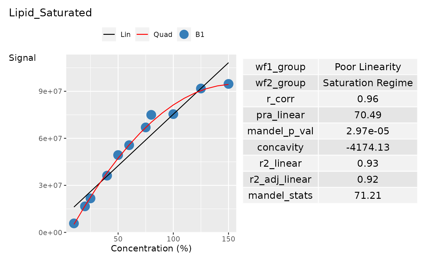
# Data Creation
concentration <- c(
  10, 20, 25, 40, 50, 60,
  75, 80, 100, 125, 150
)

sample_name <- c(
  "Sample_010a", "Sample_020a",
  "Sample_025a", "Sample_040a", "Sample_050a",
  "Sample_060a", "Sample_075a", "Sample_080a",
  "Sample_100a", "Sample_125a", "Sample_150a"
)

curve_batch_name <- c(
  "B1", "B1", "B1", "B1", "B1",
  "B1", "B1", "B1", "B1", "B1", "B1"
)

curve_name <- c(
  "Curve_1", "Curve_1", "Curve_1", "Curve_1",
  "Curve_1", "Curve_1", "Curve_1", "Curve_1",
  "Curve_1", "Curve_1", "Curve_1"
)

curve_1_saturation_regime <- c(
  5748124, 16616414, 21702718, 36191617,
  49324541, 55618266, 66947588, 74964771,
  75438063, 91770737, 94692060
)

curve_data <- tibble::tibble(
  Sample_Name = sample_name,
  Curve_Batch_Name = curve_batch_name,
  Concentration = concentration,
  Curve_Name = curve_name,
  Signal = curve_1_saturation_regime,
)

grouping_variable <- c("Curve_Name", "Curve_Batch_Name")

# Get the curve batch name from curve_table
curve_batch_name <- curve_batch_name |>
  unique() |>
  as.character()

curve_batch_col <- c("#377eb8")

# Create palette for each curve batch for plotting
pal <- curve_batch_col |>
  stats::setNames(curve_batch_name)

# Create curve statistical summary
curve_summary_grp <- curve_data |>
  summarise_curve_table(
    grouping_variable = grouping_variable,
    conc_var = "Concentration",
    signal_var = "Signal"
  ) |>
  evaluate_linearity(grouping_variable = grouping_variable) |>
  dplyr::select(-c(dplyr::all_of(grouping_variable)))

# Create the ggplot
p <- plot_curve_ggplot(
  curve_data,
  curve_summary_grp = curve_summary_grp,
  pal = pal,
  title = "Lipid_Saturated",
  curve_batch_var = "Curve_Batch_Name",
  conc_var = "Concentration",
  conc_var_units = "%",
  conc_var_interval = 50,
  signal_var = "Signal"
)

p