Here are some examples to plot curve data via
ggplot2
library(lancer)

# Data Creation

concentration <- c(
  10, 20, 25, 40, 50, 60,
  75, 80, 100, 125, 150,
  10, 25, 40, 50, 60,
  75, 80, 100, 125, 150
)

curve_batch_name <- c(
  "B1", "B1", "B1", "B1", "B1",
  "B1", "B1", "B1", "B1", "B1", "B1",
  "B2", "B2", "B2", "B2", "B2",
  "B2", "B2", "B2", "B2", "B2"
)

sample_name <- c(
  "Sample_010a", "Sample_020a",
  "Sample_025a", "Sample_040a", "Sample_050a",
  "Sample_060a", "Sample_075a", "Sample_080a",
  "Sample_100a", "Sample_125a", "Sample_150a",
  "Sample_010b", "Sample_025b",
  "Sample_040b", "Sample_050b", "Sample_060b",
  "Sample_075b", "Sample_080b", "Sample_100b",
  "Sample_125b", "Sample_150b"
)

curve_1_saturation_regime <- c(
  5748124, 16616414, 21702718, 36191617,
  49324541, 55618266, 66947588, 74964771,
  75438063, 91770737, 94692060,
  5192648, 16594991, 32507833, 46499896,
  55388856, 62505210, 62778078, 72158161,
  78044338, 86158414
)

curve_2_good_linearity <- c(
  31538, 53709, 69990, 101977, 146436, 180960,
  232881, 283780, 298289, 344519, 430432,
  25463, 63387, 90624, 131274, 138069,
  205353, 202407, 260205, 292257, 367924
)

curve_3_noise_regime <- c(
  544, 397, 829, 1437, 1808, 2231,
  3343, 2915, 5268, 8031, 11045,
  500, 903, 1267, 2031, 2100,
  3563, 4500, 5300, 8500, 10430
)

curve_4_poor_linearity <- c(
  380519, 485372, 478770, 474467, 531640, 576301,
  501068, 550201, 515110, 499543, 474745,
  197417, 322846, 478398, 423174, 418577,
  426089, 413292, 450190, 415309, 457618
)

curve_batch_annot <- tibble::tibble(
  Sample_Name = sample_name,
  Curve_Batch_Name = curve_batch_name,
  Concentration = concentration
)

curve_data <- tibble::tibble(
  Sample_Name = sample_name,
  `Curve_1` = curve_1_saturation_regime,
  `Curve_2` = curve_2_good_linearity,
  `Curve_3` = curve_3_noise_regime,
  `Curve_4` = curve_4_poor_linearity
)

curve_table <- lancer::create_curve_table(
  curve_batch_annot = curve_batch_annot,
  curve_data_wide = curve_data,
  common_column = "Sample_Name",
  signal_var = "Signal",
  column_group = "Curve_Name"
)

curve_classified <- curve_table |>
  lancer::summarise_curve_table(
    grouping_variable = c(
      "Curve_Name",
      "Curve_Batch_Name"
    ),
    conc_var = "Concentration",
    signal_var = "Signal"
  ) |>
  dplyr::arrange(.data[["Curve_Name"]]) |>
  lancer::evaluate_linearity(
    grouping_variable = c(
      "Curve_Name",
      "Curve_Batch_Name"
  ))
Here is the output of curve_table and
curve_classified
print(head(curve_table), width = 100)
#> # A tibble: 6 × 5
#> Sample_Name Curve_Batch_Name Concentration Curve_Name Signal
#> <chr> <chr> <dbl> <chr> <dbl>
#> 1 Sample_010a B1 10 Curve_1 5748124
#> 2 Sample_010a B1 10 Curve_2 31538
#> 3 Sample_010a B1 10 Curve_3 544
#> 4 Sample_010a B1 10 Curve_4 380519
#> 5 Sample_020a B1 20 Curve_1 16616414
#> 6 Sample_020a B1 20 Curve_2 53709
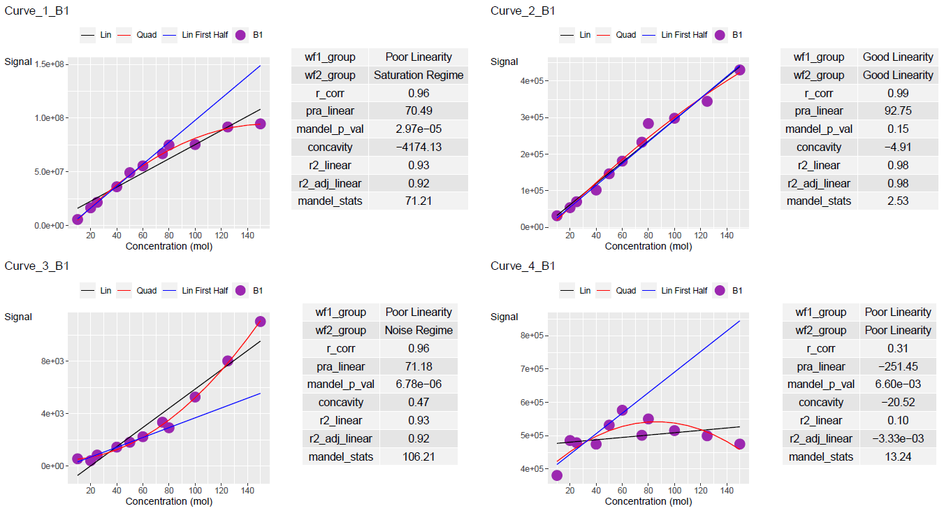
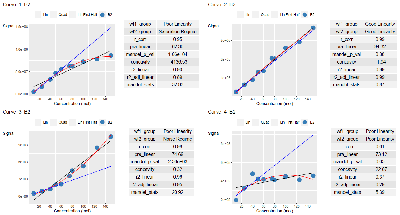
print(head(curve_classified), width = 100)
#> # A tibble: 6 × 11
#> Curve_Name Curve_Batch_Name wf1_group wf2_group r_corr pra_linear
#> <chr> <chr> <chr> <chr> <dbl> <dbl>
#> 1 Curve_1 B1 Poor Linearity Saturation Regime 0.963 70.5
#> 2 Curve_1 B2 Poor Linearity Saturation Regime 0.950 62.3
#> 3 Curve_2 B1 Good Linearity Good Linearity 0.990 92.8
#> 4 Curve_2 B2 Good Linearity Good Linearity 0.995 94.3
#> 5 Curve_3 B1 Poor Linearity Noise Regime 0.964 71.2
#> 6 Curve_3 B2 Poor Linearity Noise Regime 0.978 74.7
#> mandel_p_val concavity r2_linear r2_adj_linear mandel_stats
#> <dbl> <dbl> <dbl> <dbl> <dbl>
#> 1 0.0000297 -4174. 0.928 0.920 71.2
#> 2 0.000166 -4137. 0.903 0.890 52.9
#> 3 0.150 -4.91 0.980 0.978 2.53
#> 4 0.382 -1.94 0.990 0.988 0.868
#> 5 0.00000678 0.468 0.930 0.922 106.
#> 6 0.00256 0.321 0.956 0.951 20.9To see the regression line on half the curve points, set
plot_first_half_lin_reg = TRUE
ggplot_table <- lancer::add_ggplot_panel(
  curve_table = curve_table,
  curve_summary = curve_classified,
  grouping_variable = c(
    "Curve_Name",
    "Curve_Batch_Name"
  ),
  curve_batch_var = "Curve_Batch_Name",
  curve_batch_col = c(
    "#377eb8",
    "#4daf4a"
  ),
  conc_var = "Concentration",
  conc_var_units = "%",
  conc_var_interval = 50,
  signal_var = "Signal",
  plot_first_half_lin_reg = TRUE
)

ggplot_list <- ggplot_table$panel
ggplot_list[[1]]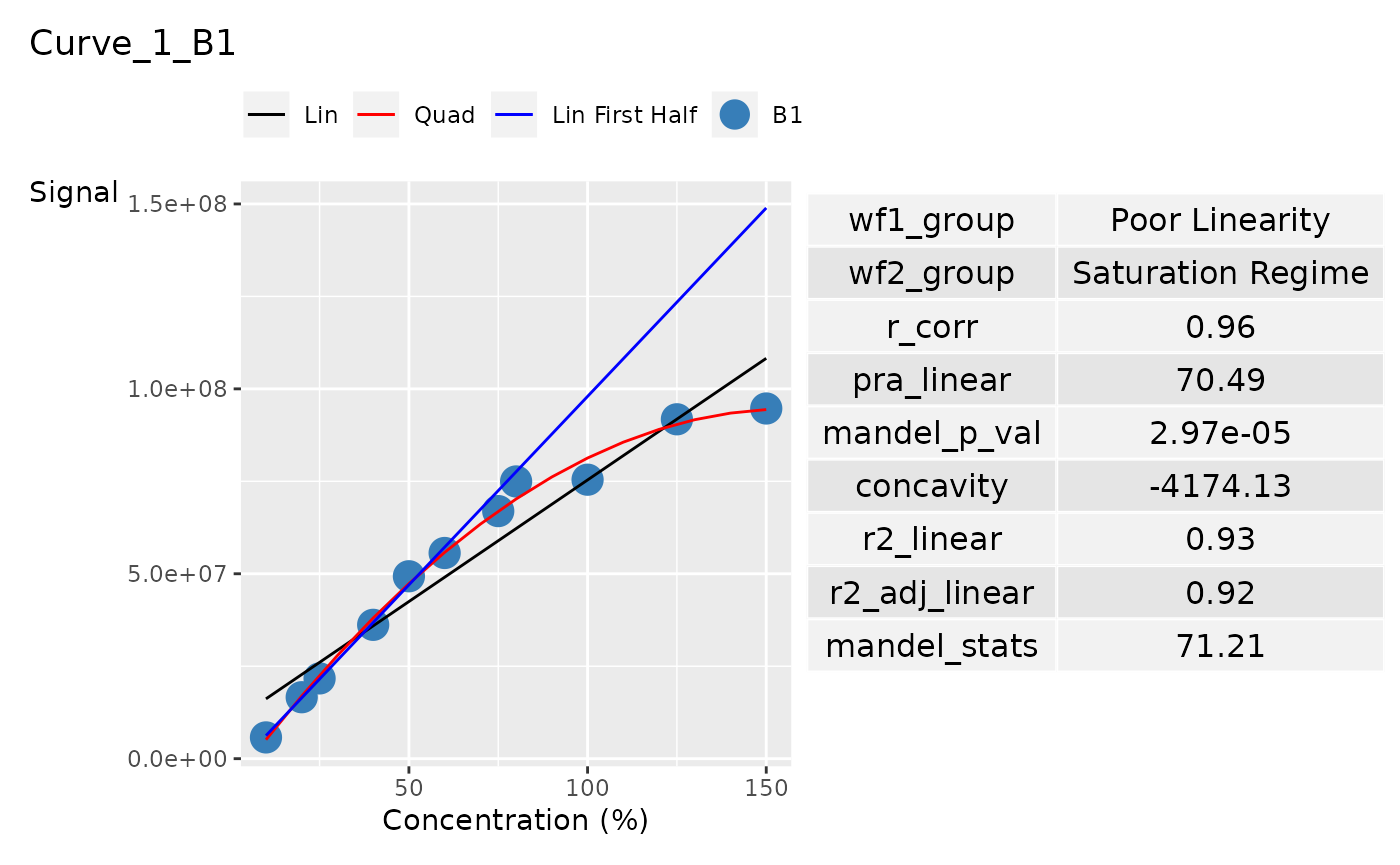
Units of conc_var and conc_var_interval can
be customised to suit the range of conc_var You can also
change the colours for your curve batch from
curve_batch_col
ggplot_table <- lancer::add_ggplot_panel(
  curve_table = curve_table,
  curve_summary = curve_classified,
  grouping_variable = c(
    "Curve_Name",
    "Curve_Batch_Name"
  ),
  curve_batch_var = "Curve_Batch_Name",
  curve_batch_col = c(
    "#9C27B0",
    "#377eb8"
  ),
  conc_var = "Concentration",
  conc_var_units = "mol",
  conc_var_interval = 20,
  signal_var = "Signal",
  plot_first_half_lin_reg = TRUE
)

ggplot_list <- ggplot_table$panel
ggplot_list[[2]]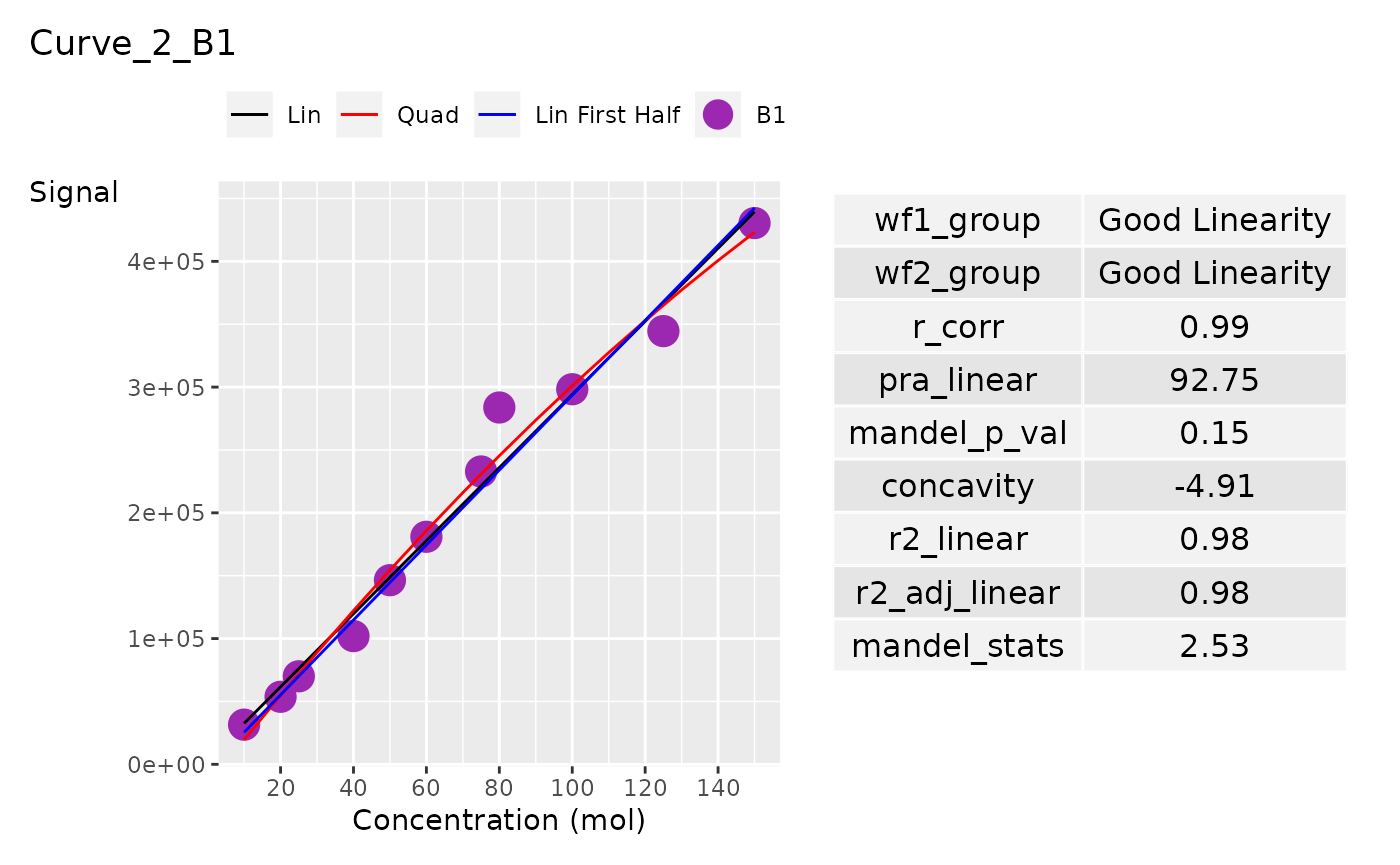
ggplot_list[[8]]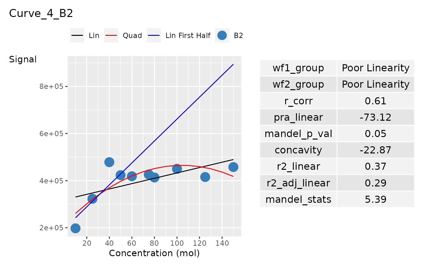
The list of ggplots can be output in pdf. You may have
to adjust the width and height accordingly.
lancer::view_ggplot_pdf(
  ggplot_list = ggplot_list,
  filename = "curve_plot.pdf",
  ncol_per_page = 2,
  nrow_per_page = 2,
  width = 15, height = 8
)