R package used to validate if a curve is linear or has signal suppression by statistical analysis and plots.
Installation
You can install the development version from GitHub with:
# install.packages("devtools")
devtools::install_github("SLINGhub/lancer")
If you want to use a proper release version, referenced by a Git tag (example: 0.1.1) install the package as follows:
devtools::install_github("SLINGhub/lancer", ref = "0.1.1")Meta
- We welcome contributions from general questions to bug reports. Check out the contributions guidelines. Please note that this project is released with a Contributor Code of Conduct. By participating in this project you agree to abide by its terms.
- License: MIT
- Think
lanceris useful? Let others discover it, by telling them in person, via Twitteror a blog post.
- Refer to the NEWS.md file to see what is being worked on as well as update to changes between back to back versions.
- Images used for hex logos are taken from the following sources:
-
Black Knight by J4p4n in 1001FreeDownloads released under CC0.

-
Mountain Range in publicdomainvectors.org released under CC0.

-
Black Knight by J4p4n in 1001FreeDownloads released under CC0.
Motivation
The Pearson correlation coefficient has been used widely to test for linearity. However, it is insufficient as indicated in Francisco Raposo (2016)
Consider a curve in the linear, saturation and noise regime.
linear_data <- data.frame(
  conc_var = c(
    10, 25, 40, 50, 60,
    75, 80, 100, 125, 150
  ),
  signal_var = c(
    25463, 63387, 90624, 131274, 138069,
    205353, 202407, 260205, 292257, 367924
  )
)

saturation_regime_data <- data.frame(
  conc_var = c(
    10, 25, 40, 50, 60,
    75, 80, 100, 125, 150
  ),
  signal_var = c(
    5192648, 16594991, 32507833, 46499896,
    55388856, 62505210, 62778078, 72158161,
    78044338, 86158414
  )
)

noise_regime_data <- data.frame(
  conc_var = c(
    10, 25, 40, 50, 60,
    75, 80, 100, 125, 150
  ),
  signal_var = c(
    500, 903, 1267, 2031, 2100,
    3563, 4500, 5300, 8500, 10430
  )
)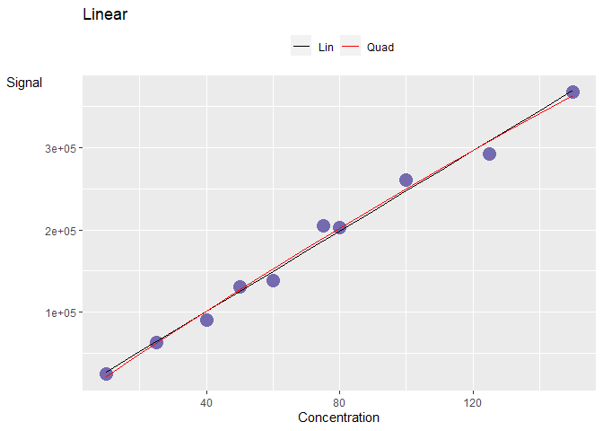
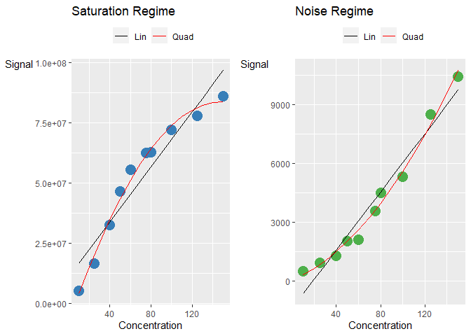
The corresponding Pearson correlation coefficient are really high (>0.9) even though the curves are non-linear. There is a need to explore better ways to categorise these curves.
cor(linear_data$conc_var, linear_data$signal_var)
#> [1] 0.9948151
cor(saturation_regime_data$conc_var, saturation_regime_data$signal_var)
#> [1] 0.9500072
cor(noise_regime_data$conc_var, noise_regime_data$signal_var)
#> [1] 0.9779585
One example is the use of the Percent Residual Accuracy found in Logue, B. A. and Manandhar, E. (2018) which is more sensitive than Pearson correlation coefficient. Observe that the linear curve gives a higher value compared to than the other two curves.
lancer::calculate_pra_linear(
  curve_data = linear_data,
  conc_var = "conc_var",
  signal_var = "signal_var"
)
#> [1] 94.32046
lancer::calculate_pra_linear(
  curve_data = saturation_regime_data,
  conc_var = "conc_var",
  signal_var = "signal_var"
)
#> [1] 62.30351
lancer::calculate_pra_linear(
  curve_data = noise_regime_data,
  conc_var = "conc_var",
  signal_var = "signal_var"
)
#> [1] 74.69452
Another example is the use of the Mandel’s Fitting Test. Observe that the two non-linear curves give a very low p value.
lancer::calculate_mandel(
  curve_data = linear_data,
  conc_var = "conc_var",
  signal_var = "signal_var"
)
#> # A tibble: 1 × 2
#>   mandel_stats mandel_p_val
#>          <dbl>        <dbl>
#> 1        0.868        0.382
lancer::calculate_mandel(
  curve_data = saturation_regime_data,
  conc_var = "conc_var",
  signal_var = "signal_var"
)
#> # A tibble: 1 × 2
#>   mandel_stats mandel_p_val
#>          <dbl>        <dbl>
#> 1         52.9     0.000166
lancer::calculate_mandel(
  curve_data = noise_regime_data,
  conc_var = "conc_var",
  signal_var = "signal_var"
)
#> # A tibble: 1 × 2
#>   mandel_stats mandel_p_val
#>          <dbl>        <dbl>
#> 1 20.9 0.00256How It Works
We try to categorise curves based on the results of three parameters.
- Pearson Correlation Coefficient ( R )
- Percent Residual Accuracy ( PRA )
- Mandel’s Fitting Test
Pearson Correlation Coefficient ( R ) can be found in Van Loco, J., Elskens, M., Croux, C. et al., Linearity of calibration curves: use and misuse of the correlation coefficient. Accreditation and Quality Assurance 7, 281-285 (2002). 10.1007/s00769-002-0487-6.
Equation ( 1 ) is used.
Mandel’s Fitting Test can be found in Andrade, J. M. and Gómez-Carracedo, M. P., Notes on the use of Mandel’s test to check for nonlinearity in laboratory calibrations. Analytical Methods 5, 1145-1149 (2013). 10.1039/C2AY26400E.
Equation ( 5 ) is used.
Percent Residual Accuracy ( PRA ) can be found in Logue, B. A. and Manandhar, E., Percent residual accuracy for quantifying goodness-of-fit of linear calibration curves. Talanta 189, 527-533 (2018). 10.1016/j.talanta.2018.07.046.
Equation ( 6 ) is used.
Workflow Proposed
Two methods are proposed to categorise the curves.
Workflow 1
Workflow 1 involves using R and PRA to categorise the curves.
- If R < 0.8, classify as poor linearity.
- If R ≥ 0.8, PRA < 80, classify as poor linearity.
- If R ≥ 0.8, PRA ≥ 80, classify as good linearity.
Workflow 2
Workflow 2 involves using R, PRA and Mandel’s Fitting Test to categorise the curves.
- If R < 0.8, classify as poor linearity.
- If R ≥ 0.8, PRA < 80, fit the quadratic model and use Mandel’s Fitting Test to see if the quadratic model is a better fit ( p value < 0.05 ).
- If not better, classify as poor linearity
- If better, check concavity of the quadratic model
- If concavity is negative, classify as saturation regime
- If concavity is positive, classify as noise regime
- If R ≥ 0.8, PRA ≥ 80, classify as good linearity
Usage
We first create our curve data set.
library(lancer)

# Data Creation

concentration <- c(
  10, 20, 25, 40, 50, 60,
  75, 80, 100, 125, 150,
  10, 25, 40, 50, 60,
  75, 80, 100, 125, 150
)

curve_batch_name <- c(
  "B1", "B1", "B1", "B1", "B1",
  "B1", "B1", "B1", "B1", "B1", "B1",
  "B2", "B2", "B2", "B2", "B2",
  "B2", "B2", "B2", "B2", "B2"
)

sample_name <- c(
  "Sample_010a", "Sample_020a", "Sample_025a",
  "Sample_040a", "Sample_050a", "Sample_060a",
  "Sample_075a", "Sample_080a", "Sample_100a",
  "Sample_125a", "Sample_150a",
  "Sample_010b", "Sample_025b",
  "Sample_040b", "Sample_050b", "Sample_060b",
  "Sample_075b", "Sample_080b", "Sample_100b",
  "Sample_125b", "Sample_150b"
)

curve_1_saturation_regime <- c(
  5748124, 16616414, 21702718, 36191617,
  49324541, 55618266, 66947588, 74964771,
  75438063, 91770737, 94692060,
  5192648, 16594991, 32507833, 46499896,
  55388856, 62505210, 62778078, 72158161,
  78044338, 86158414
)

curve_2_good_linearity <- c(
  31538, 53709, 69990, 101977, 146436, 180960,
  232881, 283780, 298289, 344519, 430432,
  25463, 63387, 90624, 131274, 138069,
  205353, 202407, 260205, 292257, 367924
)

curve_3_noise_regime <- c(
  544, 397, 829, 1437, 1808, 2231,
  3343, 2915, 5268, 8031, 11045,
  500, 903, 1267, 2031, 2100,
  3563, 4500, 5300, 8500, 10430
)

curve_4_poor_linearity <- c(
  380519, 485372, 478770, 474467, 531640, 576301,
  501068, 550201, 515110, 499543, 474745,
  197417, 322846, 478398, 423174, 418577,
  426089, 413292, 450190, 415309, 457618
)

curve_batch_annot <- tibble::tibble(
  Sample_Name = sample_name,
  Curve_Batch_Name = curve_batch_name,
  Concentration = concentration
)

curve_data <- tibble::tibble(
  Sample_Name = sample_name,
  `Curve_1` = curve_1_saturation_regime,
  `Curve_2` = curve_2_good_linearity,
  `Curve_3` = curve_3_noise_regime,
  `Curve_4` = curve_4_poor_linearity
)
The curve_batch_annot should look like this.
print(curve_batch_annot, width = 100)
#> # A tibble: 21 × 3
#>    Sample_Name Curve_Batch_Name Concentration
#>    <chr>       <chr>                    <dbl>
#>  1 Sample_010a B1                          10
#>  2 Sample_020a B1                          20
#>  3 Sample_025a B1                          25
#>  4 Sample_040a B1                          40
#>  5 Sample_050a B1                          50
#>  6 Sample_060a B1                          60
#>  7 Sample_075a B1                          75
#>  8 Sample_080a B1                          80
#>  9 Sample_100a B1                         100
#> 10 Sample_125a B1                         125
#> # … with 11 more rows
The curve_data should look like this.
print(curve_data, width = 100)
#> # A tibble: 21 × 5
#>    Sample_Name  Curve_1 Curve_2 Curve_3 Curve_4
#>    <chr>          <dbl>   <dbl>   <dbl>   <dbl>
#>  1 Sample_010a  5748124   31538     544  380519
#>  2 Sample_020a 16616414   53709     397  485372
#>  3 Sample_025a 21702718   69990     829  478770
#>  4 Sample_040a 36191617  101977    1437  474467
#>  5 Sample_050a 49324541  146436    1808  531640
#>  6 Sample_060a 55618266  180960    2231  576301
#>  7 Sample_075a 66947588  232881    3343  501068
#>  8 Sample_080a 74964771  283780    2915  550201
#>  9 Sample_100a 75438063  298289    5268  515110
#> 10 Sample_125a 91770737  344519    8031  499543
#> # … with 11 more rows
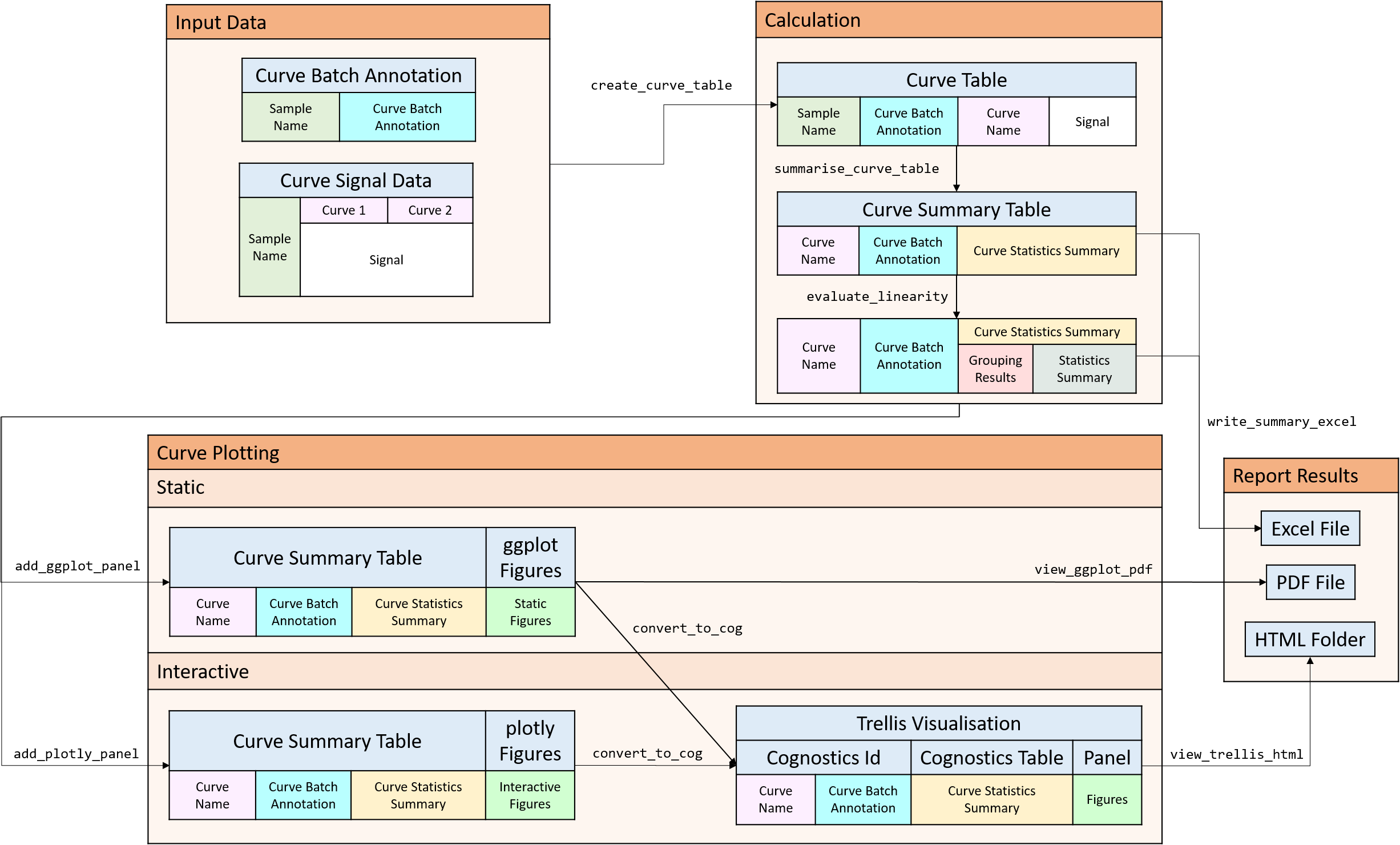
Merge the data together using create_curve_table
# Create curve table
curve_table <- lancer::create_curve_table(
  curve_batch_annot = curve_batch_annot,
  curve_data_wide = curve_data,
  common_column = "Sample_Name",
  signal_var = "Signal",
  column_group = "Curve_Name"
)
print(curve_table, width = 100)
#> # A tibble: 84 × 5
#>    Sample_Name Curve_Batch_Name Concentration Curve_Name   Signal
#>    <chr>       <chr>                    <dbl> <chr>         <dbl>
#>  1 Sample_010a B1                          10 Curve_1     5748124
#>  2 Sample_010a B1                          10 Curve_2       31538
#>  3 Sample_010a B1                          10 Curve_3         544
#>  4 Sample_010a B1                          10 Curve_4      380519
#>  5 Sample_020a B1                          20 Curve_1    16616414
#>  6 Sample_020a B1                          20 Curve_2       53709
#>  7 Sample_020a B1                          20 Curve_3         397
#>  8 Sample_020a B1                          20 Curve_4      485372
#>  9 Sample_025a B1                          25 Curve_1    21702718
#> 10 Sample_025a B1                          25 Curve_2       69990
#> # … with 74 more rows
Summarise each curve and batch with summarise_curve_table
# Create curve statistical summary
curve_summary <- lancer::summarise_curve_table(
  curve_table = curve_table,
  grouping_variable = c(
    "Curve_Name",
    "Curve_Batch_Name"
  ),
  conc_var = "Concentration",
  signal_var = "Signal"
)
print(curve_summary, width = 100)
#> # A tibble: 8 × 9
#>   Curve_Name Curve_Batch_Name r_corr r2_linear r2_adj_linear mandel_stats
#>   <chr>      <chr>             <dbl>     <dbl>         <dbl>        <dbl>
#> 1 Curve_1    B1                0.963    0.928        0.920         71.2
#> 2 Curve_2    B1                0.990    0.980        0.978          2.53
#> 3 Curve_3    B1                0.964    0.930        0.922        106.
#> 4 Curve_4    B1                0.311    0.0970      -0.00333       13.2
#> 5 Curve_1    B2                0.950    0.903        0.890         52.9
#> 6 Curve_2    B2                0.995    0.990        0.988          0.868
#> 7 Curve_3    B2                0.978    0.956        0.951         20.9
#> 8 Curve_4    B2                0.608    0.370        0.291          5.39
#>   mandel_p_val pra_linear concavity
#>          <dbl>      <dbl>     <dbl>
#> 1   0.0000297        70.5 -4174.
#> 2   0.150            92.8    -4.91
#> 3   0.00000678       71.2     0.468
#> 4   0.00660        -251.    -20.5
#> 5   0.000166         62.3 -4137.
#> 6   0.382            94.3    -1.94
#> 7   0.00256          74.7     0.321
#> 8   0.0533          -73.1   -22.9
Classify each curve according to Workflow 1 and Workflow 2.wf1_group1 gives the results of Workflow 1wf2_group2 gives the results of Workflow 2
curve_classified <- lancer::evaluate_linearity(
  curve_summary = curve_summary,
  grouping_variable = c(
    "Curve_Name",
    "Curve_Batch_Name"
  )
)
print(curve_classified, width = 100)
#> # A tibble: 8 × 11
#>   Curve_Name Curve_Batch_Name wf1_group      wf2_group         r_corr pra_linear
#>   <chr>      <chr>            <chr>          <chr>              <dbl>      <dbl>
#> 1 Curve_1    B1               Poor Linearity Saturation Regime  0.963       70.5
#> 2 Curve_2    B1               Good Linearity Good Linearity     0.990       92.8
#> 3 Curve_3    B1               Poor Linearity Noise Regime       0.964       71.2
#> 4 Curve_4    B1               Poor Linearity Poor Linearity     0.311     -251.
#> 5 Curve_1    B2               Poor Linearity Saturation Regime  0.950       62.3
#> 6 Curve_2    B2               Good Linearity Good Linearity     0.995       94.3
#> 7 Curve_3    B2               Poor Linearity Noise Regime       0.978       74.7
#> 8 Curve_4    B2               Poor Linearity Poor Linearity     0.608      -73.1
#>   mandel_p_val concavity r2_linear r2_adj_linear mandel_stats
#>          <dbl>     <dbl>     <dbl>         <dbl>        <dbl>
#> 1   0.0000297  -4174.       0.928        0.920         71.2
#> 2   0.150         -4.91     0.980        0.978          2.53
#> 3   0.00000678     0.468    0.930        0.922        106.
#> 4   0.00660      -20.5      0.0970      -0.00333       13.2
#> 5   0.000166   -4137.       0.903        0.890         52.9
#> 6   0.382         -1.94     0.990        0.988          0.868
#> 7   0.00256        0.321    0.956        0.951         20.9
#> 8 0.0533 -22.9 0.370 0.291 5.39Output Results
Results can be exported to Excel via write_summary_excel
lancer::write_summary_excel(
  curve_summary = curve_classified,
  file_name = "curve_summary.xlsx")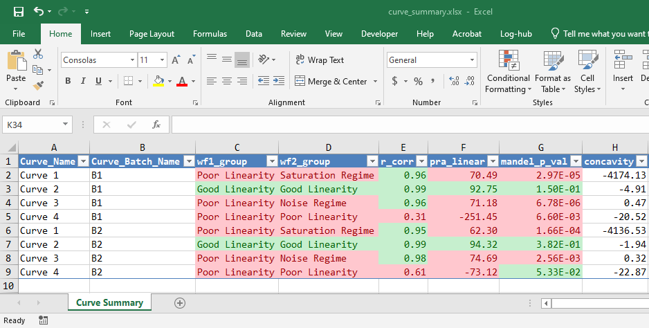
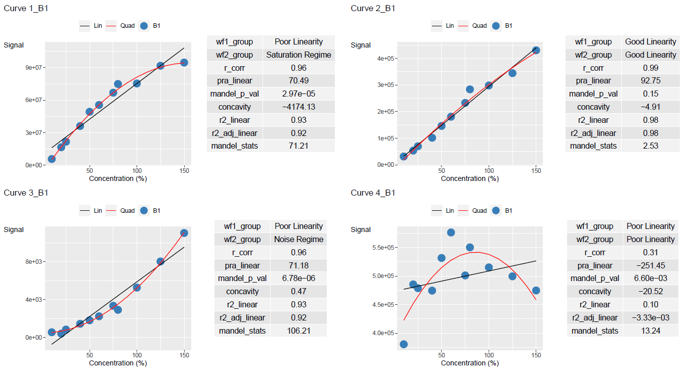
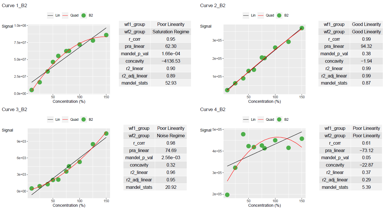
Results can be plotted using add_ggplot_panel. This will create a column called panel that contains all the ggplot plots
ggplot_table <- lancer::add_ggplot_panel(
  curve_table = curve_table,
  curve_summary = curve_classified,
  grouping_variable = c(
    "Curve_Name",
    "Curve_Batch_Name"
  ),
  curve_batch_var = "Curve_Batch_Name",
  curve_batch_col = c("#377eb8", "#4daf4a"),
  conc_var = "Concentration",
  conc_var_units = "%",
  conc_var_interval = 50,
  signal_var = "Signal"
)

# Get the list of ggplot list for each group
ggplot_list <- ggplot_table$panel
Use view_ggplot_pdf to export the plots in a pdf file
lancer::view_ggplot_pdf(
  ggplot_list = ggplot_list,
  filename = "curve_plot.pdf",
  ncol_per_page = 2,
  nrow_per_page = 2
)
Results can also be plotted using add_plotly_panel. This will create a column called panel that contains all the plotly plots.
To create an interactive trelliscope display as seen in here, each columns must be converted to a cognostics class. This is done using the function convert_to_cog
# Create a trellis table
trellis_table <- lancer::add_plotly_panel(
  curve_table = curve_table,
  curve_summary = curve_classified,
  grouping_variable = c(
    "Curve_Name",
    "Curve_Batch_Name"
  ),
  sample_name_var = "Sample_Name",
  curve_batch_var = "Curve_Batch_Name",
  curve_batch_col = c(
    "#377eb8",
    "#4daf4a"
  ),
  conc_var = "Concentration",
  conc_var_units = "%",
  conc_var_interval = 50,
  signal_var = "Signal",
  have_plot_title = FALSE
) |>
  lancer::convert_to_cog(
    grouping_variable = c(
      "Curve_Name",
      "Curve_Batch_Name"),
    panel_variable = "panel",
    col_name_vec = "col_name_vec",
    desc_vec = "desc_vec",
    type_vec = "type_vec"
  )
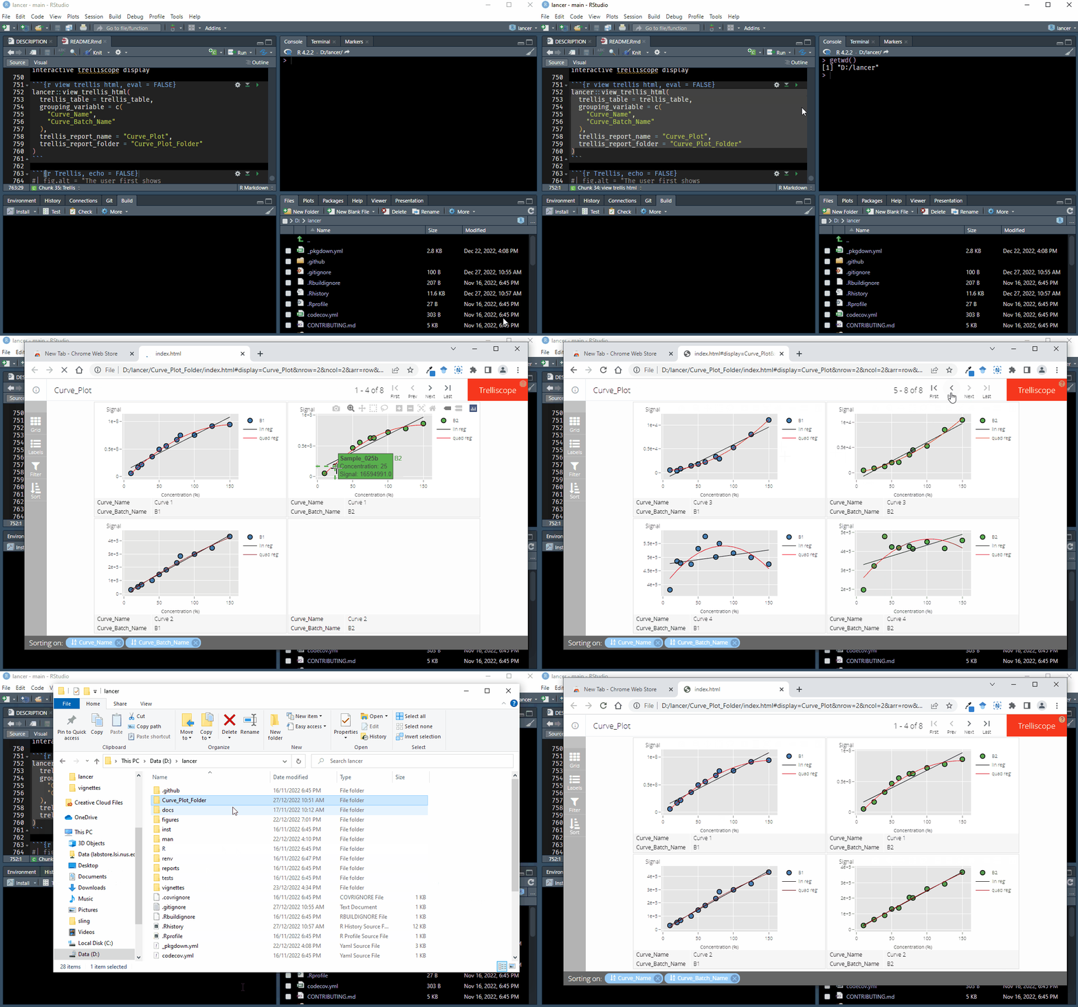
Use view_trellis_html on the R console to output the interactive trelliscope display
lancer::view_trellis_html(
  trellis_table = trellis_table,
  grouping_variable = c(
    "Curve_Name",
    "Curve_Batch_Name"
  ),
  trellis_report_name = "Curve_Plot",
  trellis_report_folder = "Curve_Plot_Folder"
)